17 Jul K&A Brand Identity Refresh: A Case Story

Katz & Associates (K&A), established in 1986, has built a strong brand as expert communicators focused on public involvement and community relations. We are nationally known for community engagement on large infrastructure projects in water, transportation and environmental markets. With a strong commitment to client service and results, K&A has become trusted advisors to our clients, who are local, state and federal agencies, engineering firms and private developers.
However, after 33 years, our firm retained the original brand visual identity system which was outdated and did not reflect the organization’s vision and creative capabilities.
In 2018, we embarked on a “refresh” of our brand identity. We decided to share the following case “story” that outlines our process, as this is the exact same process we would use when developing or refreshing a brand identity for our clients.
As you will see, the process of refreshing a brand identity is insightful, exhilarating, exhausting and emotional. But in the end, it’s extremely rewarding because it involves the entire firm and forces self-evaluation and reflection on what you are and what you hope to be.
The first step was to look back.
The Summer of ‘86
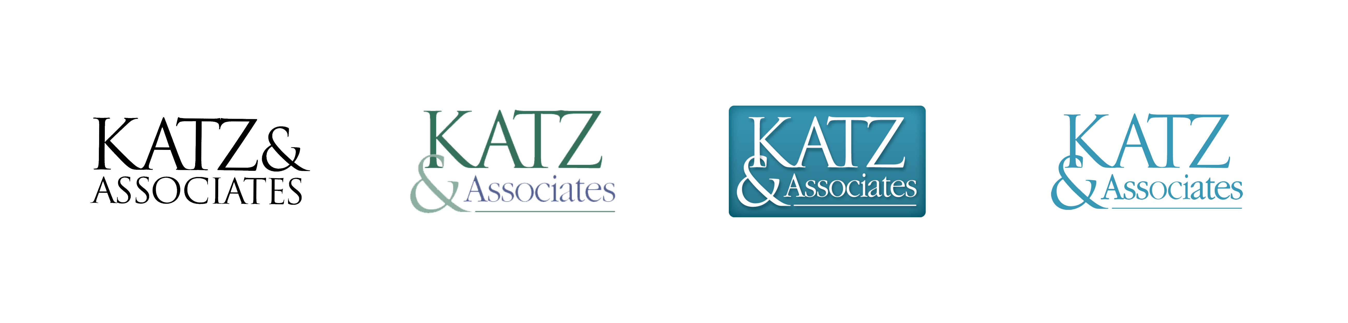
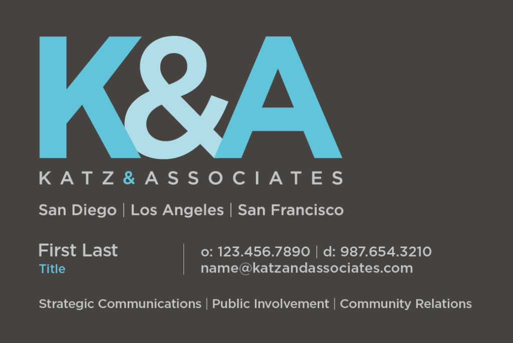
Sara Katz founded K&A in July 1986 from her first condo in San Diego. As with any new company, she needed a brand identity, which in that era pretty much consisted of a logo and not much more. Sara reached out to a graphic artist who worked at a small print shop she had been using. In true 80’s style, the first company logo was type-based and mauve on cream paper. Over the next two decades, the logo was modified at various times – the color was changed to teal in the 2000s, the ampersand moved around, the serif typeface changed to another serif typeface – but essentially it was the same mark at the beginning of 2018.
 The Spring of ‘18
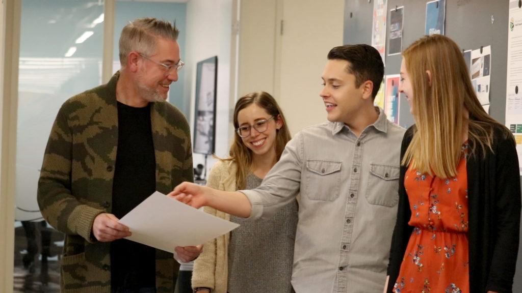
In 2018, the firm made a strategic decision to expand our in-house creative capabilities by hiring our first Art Director, Matthew Bennett, and an additional graphic designer, Kelsy DiGiovanni. Matthew and Kelsy joined the existing marketing team, David Hopkins and Dylan Fox, to form the firm’s first full service Creative Team. Our first challenge: a long-overdue refresh of our firm’s identity.
After internal discussions with leadership and staff, we set our goals:
- Modernize our logo
- Expand our identity system to work consistently across all platforms
- Transition to “K&A” (and away from “Katz & Associates”) to reflect the evolution of the firm and employee ownership
- Retain the ampersand from the original logo as a nod to the past
- Create a system that highlights our creative capabilities and could last
Our Process
The process of refreshing a visual identity is different than building a brand. Branding strategy is a longer-term initiative that includes the brand identity (which includes a visual identity), but also other elements. Based on the previous statement, it is understandable why many people confuse a logo with a brand, but a brand is a much more complex animal. (see sidebar)
Our goal was to refresh our visual identity and our logo is the most prominent and outward-facing expression of our brand identity composed of shapes, images, colors and text.
Here are the steps we always use when developing or refreshing a brand identity:
1. Meet and establish vision and goals for the new brand
Our first meeting is a discovery session to learn more about our client’s (in this case, K&A) goals, hear what’s worked and what hasn’t from past initiatives, and learn restrictions or requirements.
2. Research and design exploration
We research competitors/peer organizations, find best practices, trends and the latest data in our client’s industry. Establishing a solid benchmark not only provides a “jumping off” point for initiatives, but also provides a baseline to measure success. Then our designers take a “deep dive” into our client’s existing brand and find ways to complement and extend it through page layout templates, colors and typography.
3. Sketch and create digital concepts
Before digital concepts are done, our designers follow the traditional approach and put pencil to paper to begin the visualization process. Creating thumbnail sketches based off the creative brief helps to quickly visualize what is going to work well in different design layouts. After creating multiple drawings, they are refined and ready to be digitized. Having clear and solid drawings streamlines the digital process. After sketching and focusing ideas, our designers translate their ideas to digital concepts which include typography, color and layout. This step provides a finished and refined look which can be put into application and tested against the creative brief to ensure the desired message is being accomplished.
4. Present concepts to the client
Our team will present and explain their concepts which include showing the concepts in real-life applications digitally or mocked-up.
5. Revise and refine concepts
We will incorporate feedback from the presentation session into the concepts.
6. Finalize concepts and deliver
Upon final approval, we prepare files for printing and/or distribution (direct mail, e-blasts, websites). We archive our final files and they are always available to our clients upon request.
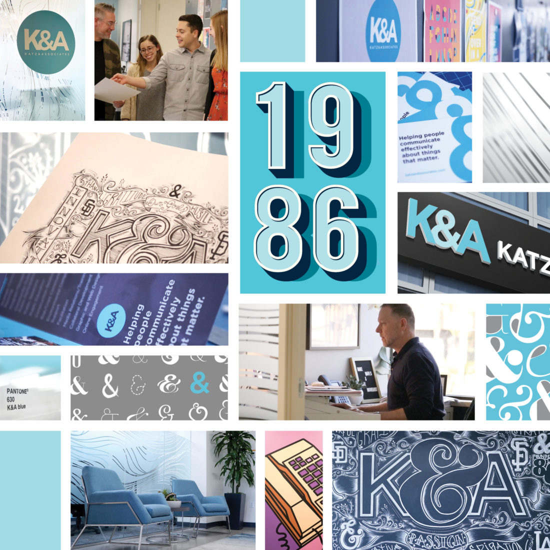
For K&A, we involved our entire staff through full company discussions, small group meetings, an online survey, water cooler conversations and some very real soul-searching. We took nothing for granted — we studied ampersand styles and their implied meanings! We explored three different color options, multiple typefaces and much more.
We ultimately arrived at a new logo that is modern, distinctive, reflects our position in the marketplace and will serve us for many years.
You Need Style
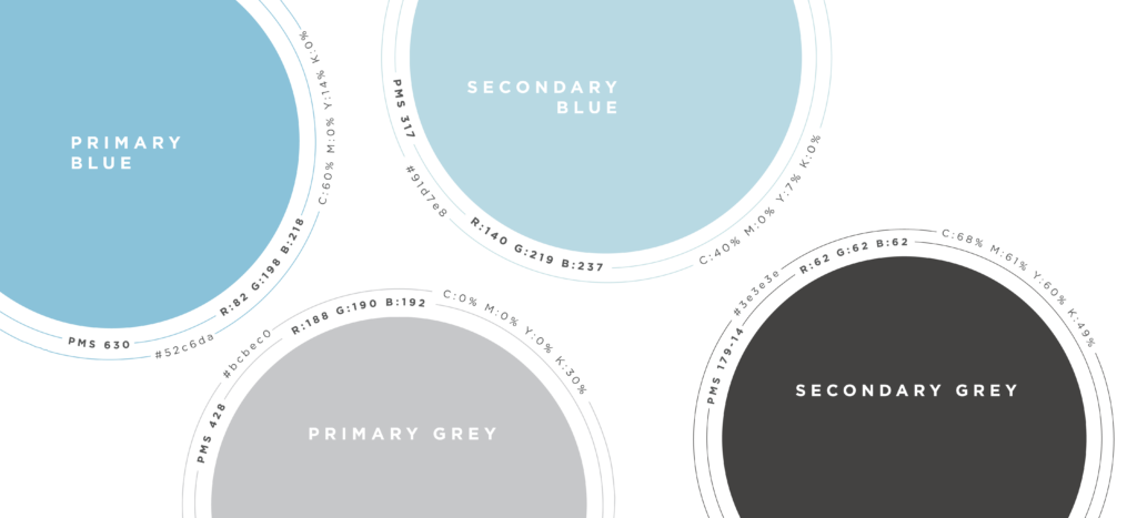
Developing the logo and supporting graphics is fun and challenging, but the work’s not over. Applying that style consistently in multiple mediums and marketing channels is the key to brand awareness. Therefore, a Style Guide is just as important as the Identity System itself (Don’t leave your designer without one!). When developed properly, Identity Systems are complex. They have primary and secondary logos, primary and secondary color palettes, multiple weight typefaces, wordmarks, minimum size and allowable clearances. Don’t leave it to an untrained eye! Our Style Guide is included as part of our Brand Identity Book, which further details the brand refresh journey and results. The full book can be downloaded here.
Brand Application
An important part of our process was imagining and mocking-up our logo options in a variety of situations including letterhead, business cards, billboards, “swag”, trade show banners and signage. Seeing the logo used in a variety of ways gave us perspective on the design early in development so that no major adjustments were needed later. Big adjustments could have been costly, and the overall identity system could have become diluted as a result. It is thrilling each time we get to see the system in action as we apply it to more and more things. Our most recent application is our renewed website that was launched in June.
Office Environment
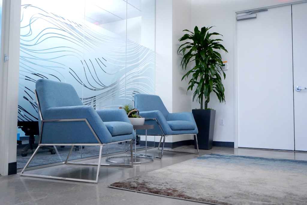
During the development of the new identity system, K&A leadership made the decision to relocate our San Diego office – our corporate headquarters – to a more central part of the city, close to mass transit and more convenient for most San Diego employees. This afforded the Creative Team blank walls and the opportunity to include branded graphics in our new space. The interior décor of our new office is a mix of refined and industrial surfaces and textures (polished concrete floors, exposed ductwork). The layout is very linear and includes a large common area, kitchen with eat-in bar, two conference rooms, a balcony and many full glass partitions for individual offices. We decided to soften the linear lines and hard surfaces with organic shapes and created a background treatment for windows and walls that we call “string theory.” This unpredictable, undulating pattern in soft gray breaks up the space and helps our corporate blue stand out. Although not initially part of our identity system, the pattern has now become part of our brand.
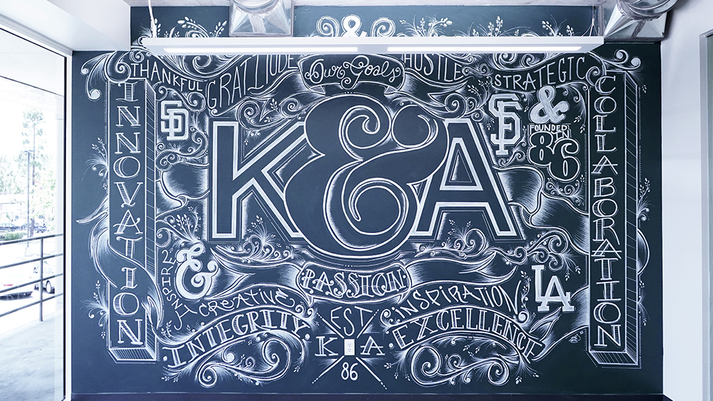
To further the organic statement in our office, Art Director Matthew Bennett, who is also a talented illustrator, decided to bring our company values to life on a large wall in the kitchen that is visible to all staff and visitors. Matthew felt it would be more authentic to hand draw the mural and step away from the computer and digital process. His love for typography and fine line lettering drawing inspired him to choose a creative lettering collage using chalk markers. He started the process with a sketch on paper and then with the help of fellow designer Kelsy, began to map out the wall and transfer the design. Over a span of four months, approximately 160 hours, some late Friday nights and 25 chalk markers it was completed! The wall has been a great conversation piece when clients visit the office and is now a virtual background for our company Zoom calls!
Future Forward
A brand should reflect where you’ve come from and where you’re going. A nod to the past with an eye on the future. For this logo version, we made the decision to intentionally focus on “K&A” rather than “Katz & Associates” (or “Katz”, which had become common shorthand). This is to highlight the evolution of our firm. Sara has been at the helm for 34 years and recognized the need for succession planning so the firm can grow and prosper. The company established a system in 2014 to transfer ownership of the firm from the founder to employees. Through stock grants and purchases, employees become owners of the firm and contribute to strategic decision-making and benefit from the firm’s economic success.
We strive to create a culture at K&A where our team members feel at home, and as such, have a commitment to K&A’s success at every level
It Takes a Village to Refresh a Brand Identity
Our K&A “village” rose to the challenge as we do with each and every assignment we take on. We are proud of our process and the result and we are all happy to hand out our business card, direct people to our website and show off our San Diego office (in non-pandemic times)!
